BI-NSIGHT – Power BI (SSRS mid 2017, Mobile Apps Update, OkViz Custom Visuals Updates) – SQL Server vNext (Get Data Experience,

Whilst last week there was not a lot of news in BI, Microsoft has been releasing some information which does make it feel like Christmas in the area of BI!

Power BI – SSRS Mid 2017

This was really some welcome news especially for the people who use SQL Server Reporting Services (SSRS) and are looking to use the Power BI Capabilities for their On-Premise data.

From the blog post, it does appear that there will be a Technical Preview from what I can understand you will be able to download targeted for January 2017.

Along with that they are looking to start with adding features for Custom Visuals, additional data connectors and Power BI Mobile apps viewing.

And finally targeting the Production ready version in mid-2017, which is fantastic.

You can read the details here: Power BI reports in SQL Server Reporting Services: Feedback on the Technical Preview

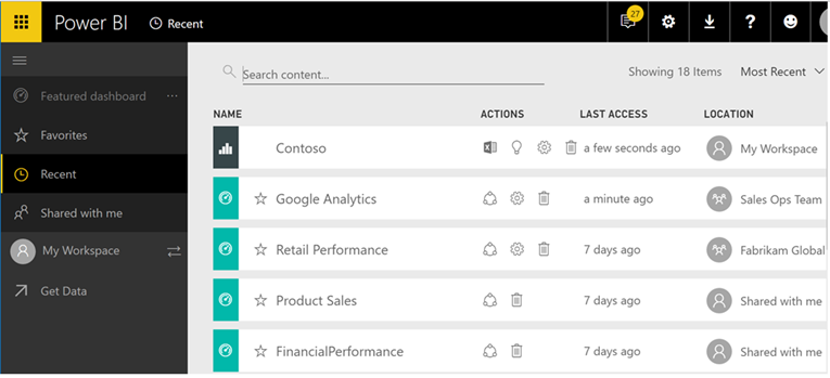
Power BI – Mobile Apps Update

Just in time for the holiday period some nice updates to the Power BI Mobile app.

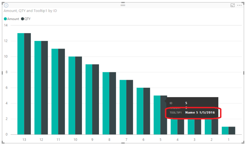
As with the image above you can now annotate and share what you want to explain via the iOS app a lot easier. As well as using a QR code to get access to dashboards.

Also they have added GeoFiltering for Android, Custom URL on an Image Tile for iOS and Android and they have also adjusted the offline background refresh so that it will consume less data.

You can find the details here: Power BI mobile apps feature summary – December 2016

OkViz – Custom Visual Updates

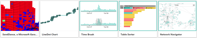
The guys from OkViz have released to new Custom Visuals which are the Candlestick and the Color Helper. I do think that often we forget about Color Blind people and this visual is a great way to assist them.

OkViz has also updated all their other existing Custom Visuals, which in the past were missing some key features such as tooltips in some of them.

You can find the custom visuals here: okviz.com

SQL Server vNext – Get Data Experience

This announcement really excites me, having worked in Power Pivot and then Power BI since its inception and now to see this coming into the next version of SQL Server is really amazing.

To me it is a natural progression, and having worked exclusively in Power BI for a few months now I have learnt a great deal, but also have found that things that were traditionally very hard to do in the past are now extremely easy or easy work arounds to shape and get your data in a format that makes for great analysis.

And to see this coming to SQL Server Analysis Services means that I can now leverage all my knowledge when this comes available. Which means that large organizations who have not been able to take advantage of this now can. As well as to have all the data hosted on premise for those that require it.

As I am sure you can understand it will start out with some limited functionality, but this is still a SQL Server vNext, and with each iteration more features will be added.

You can find all the details here: Introducing a Modern Get Data Experience for SQL Server vNext on Windows CTP 1.1 for Analysis Services

SQL Server vNext – CTP 1.1 now available

It is also great to see that there is another version for SQL Server vNext just before Christmas. And there are a whole host of updates.

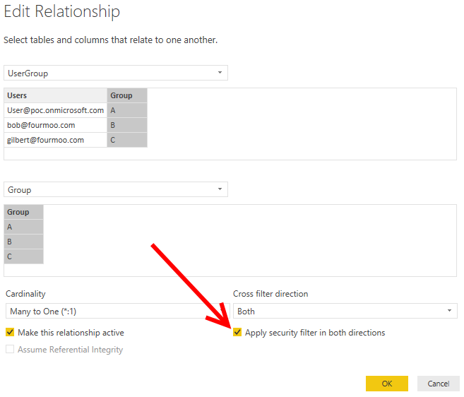
Firstly details around what is coming in Analysis Services Tabular models, which I have highlighted above with the Get Data Experience, as well as drill-down to established data, which is often what people request. As well as ragged hierarchies and finally enhanced security for tabular models where they are looking to give you the ability to set permissions on individual tables and more granular security!

As well as enhancements for SQL Server on Windows and Linux, which makes it easier to use SQL Server, as well as no doubt perform better.

The blog post details are here: SQL Server next version Community Technology Preview 1.1 now available

Power BI (DAX) – Quick Tip – How to count how many items are selected on a Slicer

Update: 16 December 2016 (I got a comment from Marco Russo, who suggested that can use the FILTERS DAX Syntax which will “Return a table of the filter values applied directly to the specified column.” As well as this should also be faster. I am all about the speed!

I was working on a Power BI Project and one of the requirements for a rather complex DAX calculation was to know how many items the user had selected for the Fiscal Year in the Fiscal Year Slicer, which would then determine which Calculated Measure to use.

The trick here is that I wanted the count to be shown correctly in the Row Context. So that the count of items selected in the Slicer is on EVERY row.

What I mean by this is you can very easily get a count by using a Distinct Count which I can show below.

As you can see above it is counting it once for each row, which is correct when using the Distinct Count.

But what I was required to do, was to have the 8 being shown on every row. But if I deselected Fiscal Year 2011, I wanted it to change to 7 across the rows.

I think that this is something that will be really useful as well as allow me to use the count to dynamically use Calculated Measures.

Example:

  • I am going to be using my Fiscal Date from my Date Table as a Slicer.
  • I am then going to get a count of the rows, and show the total rows on each row.

Solution

Below is the DAX Syntax as well as an explanation of what it is doing.

  • Original DAX Syntax

    ZCALC – Fiscal Year V1 =

    CALCULATE (

    CALCULATE (

    DISTINCTCOUNT ( ‘Date'[Fiscal Year] ),

    ALLSELECTED ( ‘Date'[Fiscal Year] )

    ),

    ALLSELECTED ( ‘Date’ )

    )

  • Updated and Improved DAX Syntax

    ZCALC – Fiscal Year V2 =

    CALCULATE (

    COUNTROWS ( FILTERS ( ‘Date'[Fiscal Year] ) ),

    ALLSELECTED ( ‘Date’ )

    )

  • The trick here is that I first get a count of the rows based on what has been filtered in my ‘Date'[Fiscal Year] column highlighted in LIGHT BLUE

    COUNTROWS ( FILTERS ( ‘Date'[Fiscal Year] ) ),

    • So what I am doing here is to get the count of rows for what has been Filtered.
  • Then what happens with the outer CALCULATE is that it now takes the totals and breaks the Date Filter Context on the rows and using the ALLSELECTED applies it to each row.
  • So what you now get is the following when all the dates are selected for 8 years
  • And then if I have to deselect Fiscal Year 2011, which now makes it 7 Years selected I now get 7 in each row

As you can see this is very handy and can be used a variety of ways.

DAX for your data

If you want to apply this DAX pattern to your data this is how you can achieve it.

If you have all your data in one table called “My Data” and you have a slicer called “Type” you can change the DAX syntax to the following.

Type Slicer Count =

CALCULATE (


COUNTROWS ( FILTERS ( ‘My Data‘[Type] ) ),

ALLSELECTED ( ‘My Data‘ )

)


  • What you need is to change the COUNTROWS to be your Slicer Column
  • And your Outer CALCULATE to be your Table Name.

Conclusion

You can see that by counting your Slicer how dynamic you can make your data.

You can download the PBIX file with the example data here (Item count on Slicer sheet): UnPivot Other Columns.pbix

BI-NSIGHT – Power BI (Mobile App Update – Android Tablets, Navigation Preview, AMA, Driving Power BI Adoption in your Organisation) – Excel (Get & Transform Update)

It does appear that as we approach the festive season, the Microsoft team are still full steam ahead, which is great for myself and the Data Analytics community.

Power BI – Mobile App update for Android Tablets

As per their blog post, it is great to see that there now is an App for the Android tablets, whilst this has been around for quite some time on the iPad tables, it has now come to Android.

It is great to see and you can find the blog post here: Now in preview: the Power BI you love on your Android tablet

Power BI – Navigation Preview

I have to say that I have already enabled the preview features, and whilst it did take a little time to get used to, it is definitely a step in the right direction.

It makes it easier to navigate when you have a lot of reports, dashboards and workspaces. As well as less clicks to get to the options that you want to use.

You can find more details here: Announcing the Power BI Navigation Preview

Power BI – AMA (Ask Microsoft Anything)

Depending on when you read this, you might be a little late, but it is great concept where you can ask Microsoft anything relating to Power BI.

I have no doubt that there will be some tough questions posed, but also a great wealth of information into Power BI.

You can see the dates and times above.

You can find the blog post here: Announcing the Power BI Ask Microsoft Anything

Power BI – Driving Power BI Adoption in your Organisation

This is a great blog post in which Microsoft gives an example of how they have used and enabled the business into data driven decisions using Power BI and how to get it adopted within Microsoft.

The really interesting part I think is that Microsoft is a large multi-country company, so if they can adopt Power BI in such a large scale, then it should be achievable with any other companies.

And not only that, but because Power BI is their own product I often like to think that because they build it, they might not use it as much as an external organisation, but they are which is great to see.

I would recommend reading through this if you are looking to get your organisation into Power BI: Driving Power BI adoption in your organization – Learn how Microsoft does this at scale

Excel – Get & Transform Update

It is great to see that there have been so many ypdates to the Get & Transform for Excel. I often feel like the Excel people do get left behind due to the sheer pace from the Power BI Team.

All of the updates are shown below

  • Web Connector—UX support for specifying HTTP Request Headers.
  • OData Connector—support for “Select Related Tables” option.
  • Oracle Connector—improved Navigator preview performance.
  • SAP HANA Connector—enhancements to parameter input UX.
  • Query Dependencies view from Query Editor.
  • Query Editor ribbon support for scalar values.
  • Add custom column based on function invocation.
  • Expand & Aggregate columns provide support for “Load More” values.
  • Convert table column to a list—new transformation.
  • Select as you type in drop-down menus.

You can read their blog post to get more details: November 2016 updates for Get & Transform in Excel 2016 and the Power Query add-in

Power BI – Using Parameters in Calculated Measures (Making Calculated Measures Dynamic based on Parameter)

What this is going to explain below is how I use a parameter that a user has entered to make a Dynamic Calculated Measure based on the Parameter entered.

Example Scenario

  • In my model I have got Parameters for the Fiscal Start Year
  • So I want to create a calculated Measure that will get me the values for 4th Year going forward
    • So what we are looking to calculate is the following, which is the Value for 2015-16
  • And then if we change the Parameters for the Fiscal Start Year as shown below
  • So I want to create a Calculated Measure that will get me the values for 4th Year going forward
    • So what we are looking to calculate is the following, which is the Value for 2017-18
  • But using the same calculation

Getting the Parameter into a table

In the steps below I am going to explain how to get our Parameter Value for the Fiscal Start Month into a table in the Query Editor

  • Go into the Query Editor
  • Then click on New Source, and select Blank Query
  • Now in my Example I name the Query “Parameter – Fiscal Start Year”
  • Next I clicked on Advanced Editor
  • I then put in the following M Code

    let

    Source = #table({“Fiscal Start Year Number”},{{#”Fiscal Start Year”}})

    in

    Source

    • As you can see above I created a table with the Column Name “Fiscal Start Year Number” highlighted in PURPLE
    • And then defined the column to have the Parameter called #”Fiscal Start Year”
      highlighted in LIGHT BLUE
  • This then results in the following table as shown below.
  • What I then did was to use the standard Query Editor Functions and changed it to the Data Type of Whole Number
  • NOTE: This is so that I can then use it to go backwards and forwards for my dynamic calculated measure.
  • The final step was to load it into my Power BI Desktop Model

Creating the Dynamic Calculated Measure

Next I will explain how I created my dynamic calculated measure, which will change based on what the Fiscal Start Date Parameter that has been selected.

  • Below is my Dynamic Calculated Measure syntax with the explanation what I did afterwards.

    Total Value for 3rd Year =

    CALCULATE (

    [Total Value],

    FILTER (

    ‘Budget Data without New Year’,

    ‘Budget Data without New Year'[Fiscal Year Number]

    = VALUES ( ‘Parameter – Fiscal Start Year'[Fiscal Start Year Number] ) + 3

    )

    )

    • What I have done is to name and start my Calculated Measure and put in the filter.
    • The part where the magic happens in the Filter
      • In here is where I specify that I want to look at the ‘Budget Data without New Year'[Fiscal Year Number] and compare that with the VALUES from my parameter ‘Parameter – Fiscal Start Year'[Fiscal Start Year Number]
      • And then I always want to go forward by 3 to get the 4th year going forward
  • So once this has run I should get the following as shown previously for Fiscal Start Year Parameter 2012
    • And I get the following below.
  • So if I change the Fiscal Start Year Parameter to 2014 once this has run I should get the following as shown previously.
    • And I get the following below.

Conclusion

By using Parameters and putting it into a table means that this can then be used to dynamically create other calculated measures.

You can download the PBIX file with the example data here: UnPivot Other Columns.pbix

BI-NIGHT – Power BI (Export to PowerPoint, New Visual Liquid Fill Gauge, Tech Tip Display Text, Automating Power BI Desktop Refresh, Webinar Create PowerApps to send real time data to Power BI) – DAX Studio (Release 2.5.0)

Another week closer to SQL Pass, and here are the recent updates and interesting articles

Power BI – Export to PowerPoint

It is great to see that after some screenshots from Microsoft Ignite that this has already been implemented into the Power BI Service. I am sure that there will be more details around this in due course from the Microsoft Power BI team.

I did export a Power BI report to PowerPoint and it exported each report to a different slide. And when you clicked on the slide it would then hyperlink you to the report within the Power BI Service. I am sure that this is the first iteration, and that the features will evolve over time.

You can find the blog post from Microsoft here: Export Power BI report to PowerPoint (Preview)

Power BI – New Visual Liquid Fill Gauge

As you can see from above there is a new custom visual, the Liquid Fill Gauge. And this is another really handy visual when you quickly want to show how your value is doing.

You can find the blog details here: Visual Awesomeness Unlocked: Liquid Fill Gauge

Power BI – Tech Tip to Display Text in Tooltips

From the people at Power BI, they have released a tech tip Thursday, with this week’s tip being how to display text as a tool tip as shown above. This can be really handy for when people are interacting and using the data.

You can find the tech tip details here: Tech Tip Thursday: Displaying text columns in tool tips

Power BI – Automating Power BI Desktop Refresh

There was an interesting blog post by Teo Lachev, in which he shows 2 different ways to refresh your Power BI Desktop File automatically.

The one option is to use a PowerShell script developed by Michal Dúbravčík (I am fairly certain that it works, but as always check the code when downloading from the internet), or the other option is to use Power Update to do this for you. Which is really easy and simple to use, as well as being extremely cost effective.

You can find the details here: Automating Power BI Desktop Refresh

Power BI – Create PowerApps to send real time Power BI

Hopefully people will see this in time, and if not I am fairly certain that they will publish the webinar later.

But please if you are interested and are using Power Apps, this looks like a great webinar to see how you can leverage Power Apps to send real time data to Power BI.

You can find details here: Webinar 10/20: Create PowerApps to send real time Power BI data

DAX Studio – Release 2.5.0

I have to say that anyone that is developing using Power BI, Power Pivot or SSAS Tabular then the DAX studio is most certainly a must have tool to have in your tool belt.

It offers a whole range of really useful and helpful ways to understand exactly what you are trying to achieve. And ensure that you do it in the most efficient way possible.

You can find the updates to DAX Studio here: DAX Studio 2.5.0 Release

Power BI – Dynamic Row Level Security – Things you need to know to get it working!

Below I am going to explain some of the caveats that you need to be aware of when implementing Dynamic Row Level Security (RLS) in Power BI. Without this I
could not get Dynamic RLS security working for me and my data.

I found that there are a few things that are currently not mentioned anywhere and it took me some time to gain an understanding. So I am hoping that with this blog post it will make it easier for you to implement Row Level Security using Dynamic Security.

Below is the link to a blog post by Kasper De Jonge in which he explains how to very quickly get up and running with RLS, as well as providing a sample Power BI Desktop Model.

Power BI Desktop Dynamic security cheat sheet

And this is what the Relationship Model looks like, which will make the explanation below a little easier to understand.

Things you need to Know!

Below are the things that I learnt and that will help with understanding the bits that make it all work together.

Testing RLS in Power BI Desktop

The first thing that you will need to update if you have downloaded Kasper De Jonge’s Power BI Desktop model is for in the relationships area. This is because it is missing a key tick box, which without it the Dynamic RLS will not work.

  • Go into the 
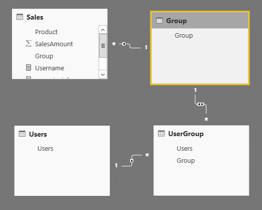
(Relationships) area in the Power BI Desktop model.
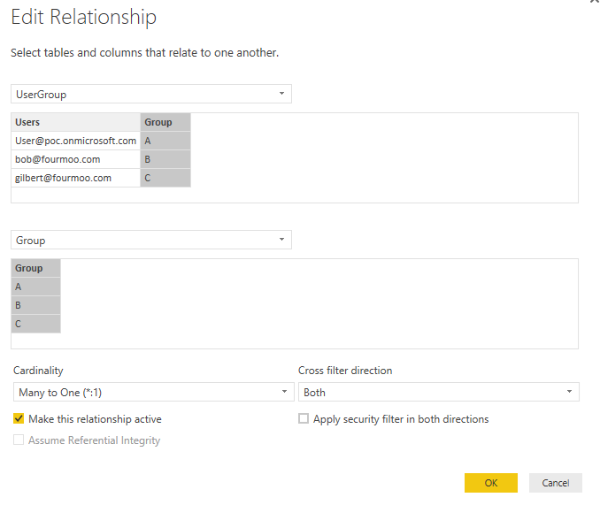
  • Then edit the relationship between the UserGroup and Group Table, when opening you will see the following below.
  • Now in order for this to work, you will need to apply the tick next to “Apply security filter in both directions”
    • NOTE: If this is not enabled or ticked the Dynamic RLS will not work correctly.
  • So once done it will now look like the following below:

The next thing to note is if you want to test RLS in Power BI Desktop you have to ensure that you have included yourself in both the Users and UserGroup
Table.

If not, you will get the following screen when click on the button.

As you can see above the Bar Visual is Blank and the Sales Amount is Blank. This is because with my current login context I am not specified in any of the Dynamic RLS tables.

Which lead me onto the next piece in understanding how the Power BI Service works.

Testing RLS in the Power BI Service

What happened was when I was initially testing this, I put in myself as a user and then a fellow
worker as a user in both the Users and UsersGroup table.

I then uploaded the Power BI Desktop file to the Service. Once it was uploaded I went into the Security for my dataset and put in name under the Roles.

Now what I expected to happen is that when I went into the report I should only see the data for Group B and Group C, the reason is because in the UserGroup table I had rows for Group B and Group C

But when I went and viewed the Report I saw the following below. As you can see I can see all the data and NOT Group B and Group C.

This took me quite a to understand and I did try a whole host of things to get it working.

This is unconfirmed by Microsoft but my own conclusion was that because I am the person who is uploading the Power BI Desktop model into the Power BI Service, I must by default have Admin (Server Administrator) rights to the model.

So no matter what I do, I will always see everything. Which makes perfect sense because I am the author of the model.

So to test this I then shared my Dashboard with another user who only had access to Group C, and when he viewed the dashboard as well as the reports he saw the following below. (NOTE: I did add his email address under Security in the Dataset)

Conclusion

Whilst it is great to now have Dynamic RLS in the Power BI Service I did struggle for some time to get it working, as well as to understand how it all pieces and works together.

And since I now know the above information I have been able to successfully roll out and test other Power BI Models successfully.

Power BI – (Twitter Solution Template, Real-time Data, Embedded GA Pricing Update, On-Premise Data Gateway Update, Monitor On-Premise Gateway) – SQL Server 2016 (SSDT Update, SSMS Update)

Here is this week’s BI updates

Power BI – Twitter Solution Template

This is the second solution template offered by the Power BI team and this time I think they have done a fantastic job. As I know of many companies who are active on Twitter and currently either do not have the resources or the time to be able to complete not only analysis of your Twitter tweets, but also the sentiment analysis.

With this solution template it allows you to very quickly and easily get this up and running. Yes you will need to have an active Azure Subscription, as well as Power BI Pro, but I think that for the larger or even smaller organizations they have already got this set up.

You can find the blog post detailing more information and how to get it up and running here: Announcing the brand & campaign management solution template for Twitter

Below is the current pricing model for the Azure related instances:

And here is the link: Pricing Information for the Twitter Template

Power BI – Real-time data

The guys from Microsoft Power BI have released another blog post where they explain how to get started with streaming data into Power BI on a dashboard.

You can then also follow this blog post by Reza Rad where he explains how to set it up and test to see how it works (Monitor Real-time Data with Power BI Dashboards)

Which you can then use to try and implement the streaming data.

Here is the blog post: Real-time in no time with Power BI

Power BI – Embedded GA Pricing Update

The Microsoft Power BI team has released an update and simplified way to understand how the Embedded pricing works.

As you can see from the above it is very simple. As well as in the blog post they also detail exactly what makes up a report session. And it is very clear to understand and see how potentially there will be a cost associated to this.

You can find the additional details here: Power BI Embedded GA pricing update

Power BI – On-Premise Data Gateway Update

Another monthly update from the Power BI team for the On-Premise data gateway. And in this months release is the ability to refresh ODBC connections.

This is something that was requested and not only that, with ODBC connections your options are almost limitless in terms of what you can connect to.

You can find the blog post details here: On-Premises Data Gateway August update

Power BI – Monitor On-Premise Gateway

This is a great blog post by Brett Powell (InsightQuest) on how to monitor the On-Premise Gateway in terms of what is being used, and what connections are being made when.

This also means that you can combine this with the other performance counter values to see how this could potentially affect the performance of your server when the data refresh is happening.

You can find his white paper here: MONITOR ON-PREMISES DATA GATEWAYS

SQL Server 2016 – SSDT Update

It is great to see that they are also updating SSDT with regular updates.

In this release there are updates to the Analysis Services Tabular Model Explorer, which gives you a better view of the objects in your tabular model.

There are also updates for the Always Encrypted.

As well as fixes and improvements.

You can find the blog post here: Introducing Tabular Model Explorer for SQL Server Data Tools for Analysis Services Tabular Projects (SSDT Tabular)

SQL Server 2016 – SSMS Update

Here is the monthly update for SQL Server Management studio.

There are a whole host of fixes and additions in the changelog.

You can find the details here: Download SQL Server Management Studio (SSMS)

BI-NSIGHT – Power BI (Upcoming Updates, Forecasting in Power BI, Q&A Updates, Row Level Security, Excel in Power BI, Cortana Integration, New Visuals, Power BI App on Apple Watch, Desktop Trend Lines, Desktop Drill Through, Desktop Conditional Formatting, Power Apps) – SQL 2016 – Part 2

Well with the Microsoft Data Insights Summit I was under no illusion that there was going to be a whole host of updates and great new features to Power BI. And it was great to see that I was not disappointed.

So here are the highlights that I thought would be great to mention for this week’s blog post.

Here is the link to the entire Blog Post from Microsoft, and below are my details from what has been released: Over 5 million subscribers are embracing Power BI for modern business intelligence

Power BI – Forecasting in Power BI

This looks like a really great feature because what it means in my interpretation is that we can now leverage Azure Machine Learning (ML) to help forecast or predict what will happen based on the data we have provided.

I do not know all the details, but I know that this will be very welcome and at least give an indication of where your data is going, either better or worse or the same.

I know that there are some other products that have this capability, but I do think that this can be optimized and over time become a lot more accurate.

Power BI – Q&A Updates

It was great to see that after the initial updates to Q&A, they now not only are providing the capability to improve the service in terms of making it easier to use. They are now giving the ability for Q&A to be run on Direct Query Data Sources.

I was not sure initially how this was going to happen in the past, but in my view I was sure that it would be a feature that would be created or designed.

I do think that having Q&A is not only a great option in terms of selling Power BI, but it also makes it really easy for users to just ask a question and get answers. Which they can then save and have as part of their dashboard. And this will be something I would even use when looking for a quick result. I can just ask the question.

Power BI – Row Level Security for Cloud and Direct Query Sources

This is really a great new feature, and as with my next highlight below what this shows is that Power BI is almost at the point of SQL Server Analysis Services (SSAS) Tabular is cloud ready or SaaS.

I know already that there are a lot of good reasons and processes to use Row Level security, so that we can re-use the one data source for multiple people and only show them the data that they need to see.

There is not a lot to talk about here in terms of how Row Level security works, because it has been around in SSAS Multidimensional for some time, but it is great to see it in the cloud or Power BI.

Power BI – Power BI Data in Excel

This leads on from the previous highlight that it appears now that Power BI is a SaaS, and that once it gets released you can use your Power BI Models in the cloud and interact with them using Excel.

This then means that you can use all the standard Excel functionality. As we all know Excel is the most widely used product from Microsoft. And people are very comfortable using Excel, as well as having great skills in what they do with the data in Excel.

Now this just gives them the capability to do this. As well as it means that you potentially do not have to create a Power BI Model and then an SSAS Tabular Model for Excel. It now can all come from one source.

Power BI – Cortana Integration

It is great to see that they are integrating more of Cortana into Power BI. And in my mind I would think that it is leveraging Cortana to convert the voice text, and then pass this to Q&A which in turn can then provide the required data. I could be totally off the mark, but I would imagine it is something along those lines.

I am sure over time that this will get smarter and more integrated.

Power BI – New Visuals

As you can see above Microsoft have released a whole host of new Power BI Visuals.

I do know that the SandDance visual got a lot of applause, and it does have some great applications that were designed with the required datasets.

I particularly like the Attribute Slicer, because it appears that this one gives you the ability to slice the data, but that it will not take up a lot of screen real estate, as well as giving the option to search for your attribute that you want to slice by.

I did think I read somewhere that now Power BI has more visuals for the users to use than any of the Microsoft’s competitors.

Here are more details of the SandDance visual: Visual Awesomeness Unlocked – SandDance

And you can to here to view all the visuals here: Welcome to Power BI custom visuals

Power BI – App on Apple Watch

Just a quick note to see that they will release an App for the Apple watch. This is great for people who like to have the updates coming onto their smart watches.

Power BI – Desktop Trend Lines

As it would happen they also show cased what is coming up in next release of Power BI Desktop.

And it is great to see that there is the ability to put in a trend line, which can often lead the user to understand the trend of the data that they are looking at.

Power BI – Desktop Drill Through

I personally know that this is something that I have been looking for, as well as very often people have said that Power BI is great but there is no drill through functionality.

Well now it is here and it is awesome. And I know that already when chatting to my fellow peers that they are happy and amazed that it has been done. Which means we can then leverage more of Power BI.

Power BI – Desktop Conditional Formatting

I know that often it helps people to better understand the data when there is some conditional formatting that has been applied.

It is great to see that we now have the ability to do this which will further enrich the Power BI experience.

Power BI – Power Apps

I have no doubt that as time goes on there will be a better or tighter integration with Power BI and Power Apps, as a means of getting data into Power BI which can then be used to further enrich the Power BI experience as well as the related data.

SQL 2016 – Part 2

In part to of the details of SQL Server 2016 they go into the SSAS improvements and new features.

I know quite a bit of this has been released before, but this is one central page where you can see all the improvements, to which there are many as well as additional features.

If you want to see all the improvements and updates you can read about it here: Enable business insights for everyone with SQL Server 2016: Part 2

BI-NSIGHT – Power BI Desktop (Monthly & Service Update) – Excel 2016 (Add-In for Machine Learning) – Power BI (Sankey Visual, Power BI Community, Office365Mon Content Pack)

As this year begins to really wind down it is good to see that the Microsoft machine also appears to be having a break.

I have no doubt that in 2016 it will be full steam ahead and back into the swing of things.

And before I could finish this blog post I checked if there was any news and low and behind there is a MASSIVE update for Power BI Desktop and the Power BI Service.

I won’t lie there are so many good and improved features that put down what you are doing and read below. It will sure make your week!

So let’s get into it!

Power BI Desktop  – Monthly & Service Update

Wow there is a lot of information in the blog post from Microsoft.

I am not going to go into all the details, but I will go into what I find especially great improvements or additions.

The first section with regards to the Formatting Pane & Ribbon really does have some great features. What I like is that you can now change the text size, the number of decimal places and formatting of data labels per category or report or item.

I also like the fact that you can now align your charts, reports or whichever report item that you insert. I personally know that previously this took a lot of time and effort to get this working. As well as the format painter option which means you can apply the same formatting across the entire report. Which will not only save time, but in my opinion make the reports look even more polished and professional.

In the next section with regards to the Enhancements to Visualizations they have done a lot of work. From ensuring that the visual cues are easier to see and understand. As well as improving how the data labels are displayed so that the actual charts show more meaningful information.

I see that they have snuck in another Visual, which could be used in quite a few ways to show valuable information. As well as adding the tooltips which I have already seen and used in the Power BI Service, and something very similar in the mobile app. This does make interacting with the reports and looking at the right information a lot easier and quicker.

Next is the ability to create visuals based on R scripts. I already know that the SQL Server stack is getting a lot of praise for including this in their next release. And it is really great to see it making it into Power BI also. I have no doubt that this will get a whole lot of interest with regards to R. And by the looks of things they have made it really easy to get the R scripts and information into Power BI.

In the Data Modeling area, they have once again added a lot of functionality. I like that they have added the relationship view, which means that it makes it easier to navigate when you have a large set of tables with relationships.

I am sure that there will be a lot of people will be very happy to see that SSAS Multi-dimensional is getting some love. And that now after you enable the preview feature you can now use your Hierarchies in your Power BI report. This will go a long way to get report authors to very quickly create some amazing reports.

They have also sneaked in another two connectors. Namely Stripe Connector which is for manage their online payments. And Smartsheet Connector which will allow users understand how Smartsheets is being used in the ways of workspaces, sheets, top collaborators etc…

The Enter data, was something that I possibly had thought of in the past that would be useful. For instance, you might have some reference data that you know is not going to change. And before today you would have to put it into a CSV or a table to get the data into your model. Now you can quickly do a copy and paste and your data is there. What a fantastic thing to have at your fingertips!

I see that they have made more improvements with Direct Query, which is great to see, considering that if your underlying source system will be SQL Server 2016 in the future with Column Store Indexes or In-Memory tables, this gives you the ability to have near or real time data in your reports.

Those are the details which I think are really important and valuable.

Below is the entire list of updates:

  • Report Authoring
    • Formatting Pane & Ribbon
      • Format data labels per category series
      • Change number of decimal places showed in visuals
      • Change text size in visuals
      • Ability to lay out visuals accurately: alignment, distribute, size, position (requires Power BI Desktop for authoring)
      • Set styles across multiple visuals through Format Painter (requires Power BI Desktop for authoring)
    • Enhancements to Visualizations
      • Visuals cue for sort state in Table visual
      • New Visual: Stacked Area chart
      • Smart tooltips for Area and Line charts on hover
      • Ability to create Reference line/region for a Cartesian visual
      • Improved data labels for pie and scatter chart
  • R Visuals integration in Power BI Desktop (Preview Feature)
  • Suggested table to table relationships when trying to create visuals involving two tables which are not related (Power BI Desktop only)
  • Optimized “Home” ribbon layout in Power BI Desktop
  • Data Modeling (Power BI Desktop only)
    • Relationships View
      • Zooming Slider
      • Fit Zoom to Screen
      • Reset Layout
      • Ability to Zoom in using Ctrl-Mouse selection rectangle
    • Data Connectivity (requires Power BI Desktop for authoring)
      • SSAS Multidimensional support – Hierarchies support (Preview Feature)
      • Stripe Connector
      • Smartsheet Connector
      • “Enter Data”: Paste or enter data to create a table
      • DirectQuery Improvements: Support for all data types of T-SQL and SAP HANA, resulting in Performance improvements.
      • ODBC Connector: Support for selecting User/System DSNs
      • CSV Connector: Ability to specify Column Delimiter in the Source dialog

You can find the Power BI Desktop Blog update here: More Power BI Feature Updates: Power BI Desktop December Update and new Power BI service features

Excel 2016 – Add-In for Machine Learning

It is great to see that they are putting some of the Machine Learning (ML) funcationality into Excel. Which as explained as per the blog post, means that you can then take this data and very easily do sentiment analysis on your data.

Which I know can provide some very insightful information.

They have also made it really easy and simple to use. And I can hopefully see myself using this in the near future.

You can get all the details here: General Availability of Free Excel Add-In for Azure ML

Power BI – Sankey Visual

Once again this is very good and insightful visual that has been created.

It appears that it is used primarily in the energy industry but I think that it could have quite a few other uses for all different types of data.

You can find out the details and how to get it from the following blog post: Visual Awesomeness Unlocked – Sankey diagram

Power BI – Community

This is a quick blog post to let people know that there are more and more Power BI community groups popping up all over the world.

I think that this will be a great way to find like-minded people. As well as to see what other amazing things people are doing in the Power BI space.

So I suggest that you either join or create a local group.

You can find more information about it here: Microsoft Power BI Community

Power BI – Office365Mon Content Pack

This is another great and insightful content pack.

To me when using the cloud services, you often do not have a clear visibility in terms of what has been happening with your actual service that you are receiving.

This content pack gives you all that information at your fingertips.

I also have to admit in my opinion that it is really great to see that Microsoft are making this information available. To me is shows that they know that they are not perfect and that at times things do go wrong. But hopefully not every often. And this gives you a way to see if or when something happened.

You can find details about the content pack here: Analyze your Office365Mon data in Power BI

BI-NSIGHT – Power BI Desktop (Date Hierarchy) – Power BI(Timeline Slicer Visual, Pin Excel Range to Dashboard, Power BI User Groups, Weekly Service Update, Visual Studio Application Insights Content Pack) – Microsoft BI Reporting Road Map – SQL Server 2016 SSIS Updates

With the Pass conference completed last week there has been a lot of information about SQL Server 2016 and the future does indeed look bright for BI within the Microsoft BI stack. And I personally think that in the future they will be leading in most of the BI areas.

I am not going to go into all the details as this has been covered in a whole host of other blogs that I follow. And I am sure that a lot of the people reading my blog have already found out all the new amazing news.

So here we go with all updates from the past week.

Power BI Desktop – Date Hierarchy

The above screenshot was taken from Jen Underwood, which is showing how in the future version of Power BI Desktop it will have the ability to be able to create the Date Hierarchy for you. I am sure it will be in a not too distance release.

Power BI – Timeline Slicer Visual

As promised as Pass last week here is another great Custom Visual available in Power BI.

I can see this being used a lot, as I have used it in Excel in the past and it does allow users the ability to slice their data by Month to Date, Year to Date, Quarter to Date etc…

You can find all the custom Visualizations here: Power BI Custom Visualizations

Power BI – Pin Excel Range to Dashboard

Another feature that will be coming to the Power BI Service is the ability to Pin an Excel Range into your Power BI dashboard.

I think that this will be really useful, because Excel does some things really well. And often it can show you a lot more information, which can easily be digested instead of trying to replicate it Power BI.

Power BI – User Groups

This is another great incentive, as I think as the momentum grows with Power BI this will be a great way to network with like-minded people.

As well as learn from other people who I have no doubt will have some amazing idea’s and experience to share.

Here are the details if you are interested to Sign up or see if there are people in your area: Power BI User Groups are here!

Power BI – Weekly Service Update

There were some interesting updates this week, which is that you now get a guide in what you want to do in Power BI.

As well as now individuals can also sign up for Power BI. I do think that this is a very clever move. As there are a lot of people who potentially might use it at work, and then want to use it for their personal projects. Along with this you can get the general public to start using this service. And often this can attract a larger crowd than the amount of people that will be exposed to the Power BI service. Which in turn could get Power BI into a company!

And finally is the duplication of an existing report. Which often can help when you want it to be very similar and do not want to have to re-create it all from scratch!

You can find out all the details here: Power BI Weekly Service Update

Power BI – Visual Studio Application Insights Content Pack

This week’s Content Pack is about Visual Studio applications and can give you insight into your applications that you have created and can show you potentially where you have issues.

You can find out how to use the content pack and more details here: Explore your Application Insights data with Power BI

Microsoft BI Reporting Road Map

As has been blogged quite extensively it is the first time since I have started my career in BI, that there has actually been a roadmap for BI from Microsoft.

I have to say it is great that we now have this visibility, because it means we can plan for what is coming. And incorporate some of the new changes into our existing and to be delivered projects. Which means we will be in a position to show the people in our business something that is new and fresh.

And the way that I see it, people like to see things change. Not everyone in the business, but at times even if the charts just change slightly or there is something additional it can mean that there is great adoption. It also shows that it is not something that been developed and never looked at again!

I do feel that they are focusing a lot on SQL Server Analysis Services Tabular. And for good reason, this product is playing catch up. It is also being used in Power BI, which we all really love and are using more often. And I can see that we are also starting to get the best of both worlds. And by that I mean we are getting a lot of the functionality from SQL Server Analysis Services Multidimensional, as well as from TSQL. Which means that we can leverage the best of both.

You can find out all the information about the BI Reporting Roadmap here: Microsoft Business Intelligence – our reporting roadmap

SQL Server 2016 – Integration Services Update

The link below are all the updates from Wolfgang Strasser (w|t) with regards to all the great updates that are coming to SSIS 2016.

I am looking forward to see how the Package Control Flow Templates, as the way I see, this will mean that you can leverage creating the template once, and then reuse it again and again. So for example if you create a Package Control Flow Template for a Slowly Changing Dimension Type 2. You can then use this in your framework for all your other developers.

You can read his blog post here: SQL Server 2016 Integration Services (SSIS) –Summary of SQL Pass Summit 2015 session